Part 1: WAVE Accessibility Check

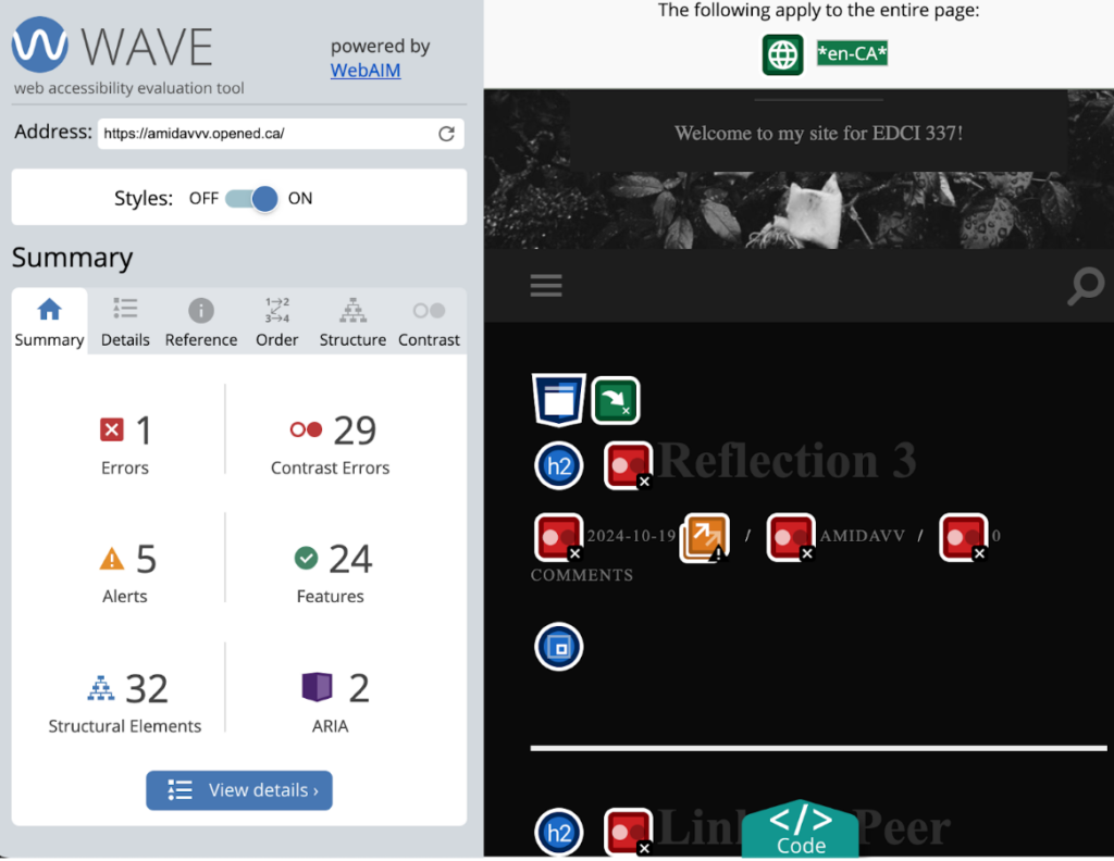
After creating the WAVE accessibility check, I was surprised to discover the various ways in which I can improve the accessibility of my site. I plan to improve the visibility of text and ensure that all images have appropriate text descriptions. This will enhance user experience and accessibility going forward.
Part 2: Canva Infographic and Reflection

Reflection
Question One: Which design principles did you follow to create your infographic in Canva? Which elements of a ‘good infographic’ were you able to incorporate? What other principles did you consider? What does using a template or generated design make easier and what does it make harder when creating your infographic? Did your target audience influence your choices?
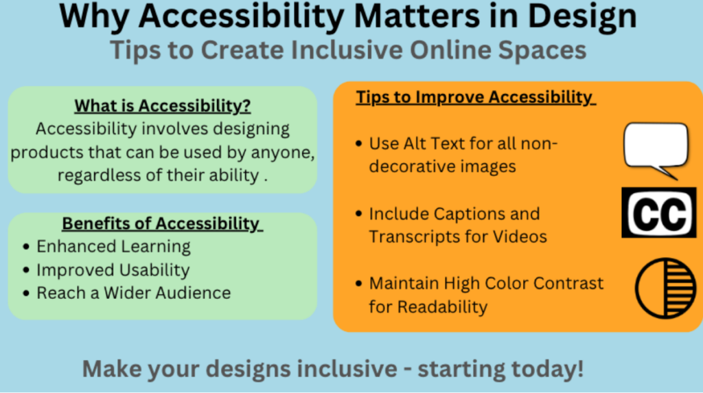
When creating my infographic, “Why Accessibility Matters in Design,” I followed several fundamental design principles to enhance clarity and engagement. One key principle was hierarchy, which I established using varying font sizes and boldness for titles and section headers. This will help to logically guide the viewer’s eye through information. I also focused on alignment by ensuring that all elements, such as text and icons, were neatly arranged and consistently spaced. This organization helps enhance readability, making the information more digestible to readers.
I also incorporated a cohesive color palette of soft blues, greens, and accent oranges, which creates an inviting visual experience while ensuring proper contrast for readability. I also included relevant icons and illustrations to break up text and convey concepts visually. This not only maintains interest but also reinforces the content, catering to various learning styles.
While using a template in Canva simplified the design process by providing a structured layout, it also posed some challenges. Templates can sometimes restrict creativity or limit customization, making it harder to convey a unique brand or personal style. However, the time saved in formatting and layout decisions allowed me to focus more on content development, which is often the most crucial aspect of an infographic.
My target audience for this assignment was design students similar to myself. This significantly influenced my choices as I aimed to create a visually appealing yet educational tool that not only informs but also motivates students to consider accessibility in their work.
Question Two: Graphic design is inherently visual – what additions or modifications could you make to ensure that learners with visual impairments have access to the same information in an infographic in an online setting?
To enhance accessibility for learners with visual impairments, I would consider several modifications. First, providing a text-only version of the infographic would ensure that key information is accessible to screen readers. Additionally, using high-contrast colors and larger, clear fonts can aid those with low vision.
In summary, by applying essential design principles and considering accessibility modifications, I created an infographic that effectively communicates its message to a diverse audience while being mindful of inclusive practices.
I really enjoyed your Canva infographic! I think you used both contrast and hierarchy very effectively, as well as spacing.…
This is such a thoughtful reflection! I love how you broke down both the lesson design using Merrill’s principles and…
Great post! I love how you’re focusing on improving accessibility and sharing your process with the WAVE tool. It’s amazing…
Hi Ami, I really enjoyed watching your video. It was very engaging and the editing style was captivating. I love…
Hi Ami, Your blog post is both insightful and practical, especially in how you apply Merrill’s principles to address a…
Leave a Reply
You must be logged in to post a comment.